Hagelwood Script: A Rustic-Modern Typeface for Digital Branding
As a web designer who builds landing pages, SaaS dashboards, and boutique e-commerce experiences, I look for typefaces that do more than look pretty—they need to perform. Hagelwood Script stands out not just for its warmth and character, but for how thoughtfully it integrates into real digital interfaces. It’s a premium script font—part of the Script Amp category—that balances organic flow with structural clarity, making it ideal for designers who value both personality and precision.
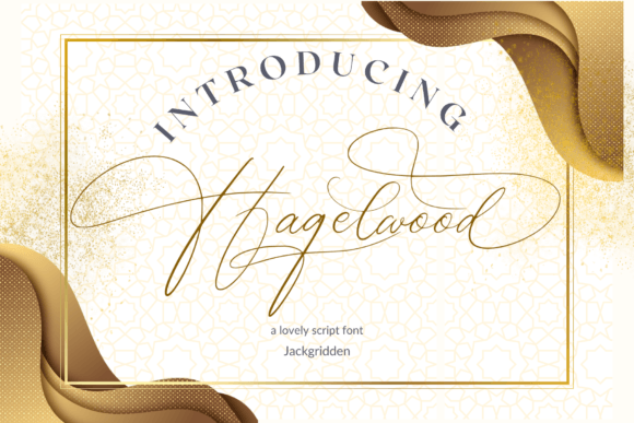
Hagelwood isn’t a chaotic handwritten font. Its letterforms carry subtle contrast, gentle tapering strokes, and consistent rhythm—traits that translate well to screen rendering. The lowercase ‘g’, ‘y’, and ‘s’ have graceful exits; capitals feature soft terminals and balanced proportions. This isn’t calligraphy mimicked digitally—it’s a purpose-built display font designed for legibility at larger sizes, especially in hero sections, product banners, or branded content blocks where tone matters as much as text.
In practice, Hagelwood shines most when used intentionally—not everywhere, but where it adds meaning. Think: the headline above your hero CTA button, the title on a course sales page, or the tagline overlaying a nature-themed background image. Because it’s a script font with moderate x-height and open counters, it remains scannable even at 32–48px on desktop and holds up surprisingly well down to 28px on large mobile viewports—provided you avoid cramming full paragraphs into it.
For visual hierarchy, Hagelwood works best as a top-layer typographic anchor. Pair it with a clean, neutral sans serif like Inter, Poppins, or Manrope for body copy and interface labels. That contrast reinforces structure: Hagelwood sets the emotional tone (rustic, sincere, unhurried), while the sans serif delivers clarity and function. On a coaching website, for example, Hagelwood might introduce the headline “Your Calm Starts Here”, while Inter handles the bullet points, form fields, and navigation—creating trust through balance, not noise.
It also pairs elegantly with low-contrast serifs like Literata or Cormorant Garamond for editorial-style layouts—say, a blog header or a newsletter banner where you want warmth without sacrificing authority. Avoid pairing Hagelwood with other scripts or overly decorative fonts; its strength lies in its quiet confidence, not competition.
On dark backgrounds, Hagelwood maintains presence—especially if you use its default weight with slight letter-spacing (0.5–1px) to prevent stroke crowding. For light-on-dark use, ensure sufficient contrast (at least 4.5:1) by testing with browser dev tools. Over imagery, apply a subtle semi-transparent overlay or soft drop shadow—never rely solely on background texture to make the script readable.
Hagelwood is optimized for web delivery: available in WOFF2 format, with full Latin character support, basic OpenType features (including stylistic alternates for ‘a’, ‘g’, and ‘y’), and seamless CSS @font-face implementation. There’s no bold weight—but that’s intentional. Its single-weight design encourages disciplined usage: one expressive voice, not multiple competing tones. That restraint makes it easier to maintain consistency across a brand kit, digital ad set, or Shopify theme.
For online stores selling artisan goods, handmade ceramics, or wellness products, Hagelwood subtly signals craftsmanship and care—without needing illustration or photography to do all the work. Used in a banner for a limited-edition candle launch (“Forest Hearth • Hand-Poured”), it elevates perceived value. In a portfolio site for a nature photographer, it introduces section headers like “Alpine Light” or “Coastal Stillness” with grounded elegance—no clichéd “hand-drawn” kitsch, just sincerity in form.
Readability on mobile requires extra attention. Never use Hagelwood below 24px for primary headlines on small screens—and avoid tight line-heights. Set line-height: 1.3 minimum, and always test on iOS Safari and Chrome Android. If your layout includes dynamic text resizing (e.g., user zoom), consider fallback rules that switch to a system script only in edge cases—though Hagelwood’s robust hinting handles most responsive scenarios gracefully.
Licensing is straightforward but essential to note: Hagelwood is a commercial font. You’ll need a web license for live sites—even portfolio projects hosted publicly. Most vendors offer tiered plans covering domains, pageviews, or unlimited usage for agencies. If you’re building templates for marketplaces like ThemeForest or Figma Community, confirm extended licensing covers redistribution. Never self-host from free font aggregators—those files often lack proper web formatting, multilingual glyphs, or legal permissions.
Where Hagelwood doesn’t belong: dense navigation menus, form inputs, data tables, or any UI element requiring rapid parsing. It’s not a workhorse—it’s a signature. Use it where users pause, not skim. That’s why it excels in conversion-focused layouts: a single, resonant phrase in Hagelwood before a “Get Started” button creates momentary emotional alignment—increasing click-through not through urgency, but through authenticity.
For creative entrepreneurs launching a brand kit or digital product, Hagelwood supports cohesion across touchpoints. Apply it consistently to your Figma design system tokens, Notion brand guidelines, email header graphics, and Canva social templates. When paired with intentional spacing, restrained color palettes, and ample whitespace, it becomes part of a broader visual language—not just typography, but tone made tangible.
If you’re evaluating Hagelwood for your next project, ask: does this headline need to feel human, not algorithmic? Does this brand benefit from warmth over polish? Does this layout reward a slower, more considered read? If yes, Hagelwood isn’t just a font choice—it’s a strategic alignment between voice, interface, and intention.